
Recently I’ve been leading the product design team at Amperity in a deep-dive into data visualizations: which ones to use for different use cases, and how to simplify them to highlight a narrative. We’re going through a great book I’d recommend by data viz expert Cole Knaflic called “Storytelling with Data”. Years back I took her data visualization workshop and loved it, and if there’s one thing I wholeheartedly endorse about this guide it’s that it completely hates on pie charts.
I get asked frequently about my burning hatred for the infamous pie chart, so I decided once and for all to document this rant.

Why Pie Charts are the Worst:
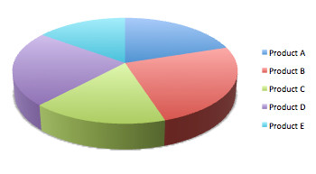
- Pie charts are hard to understand. Human beings are not good at spatial estimation of the areas of two or more differently-shaped objects tilted at different angles for comparison to each other.
- If you have more than five slices, values become even harder to compare against each other.
- If you simply rotate the pie, a person will value the cuts of the pie differently even though you haven’t changed the weight of each slice (there’s a wonderful illustration of this by Stephen Few).
- Worse, if you make it a 3D pie chart, you can manipulate people into believing the “closer” slices are larger than the further slices due to tricks of perspective.
- They take a lot of space to convey their message (albeit poorly).
- Pie charts imply 100% of a whole is represented, but that’s not always true.
- Almost any use case you have for a pie chart, another chart can be used to more accurately convey information.
Alternatives to Pie Charts
If you must use a pie chart, this handy gif shows my recommendations for how to fix it:
Seriously, if you want to use a pie chart, at least try this exercise first: make it a horizontal bar chart and ask yourself which is easier to quickly read. I loved this quintessential example from Bernard Marr:
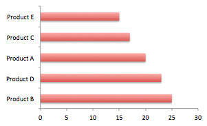
“Which one tells you at a glance that Product D sold more than Product C, and that Product A is in 3rd place?“
When to Use a Pie Chart
The truth is, pie charts can be used for good and not evil, given some very, very specific set of scenarios. ALL of these must be true:
- You are comparing a small number of categories (ideally 2-4),
- The categories are all mutually exclusive,
- The categories all add up to 100% of the whole of something, and it’s important to convey that fact, in fact it’s more important than people really understanding the difference between the sizes of each slice of pie, and
- It’s not that important that people can compare the slices to each other with a good level of accuracy (e.g., one piece is way bigger than the rest combined and that general point is the only thing that you’re trying to get across to viewers).
If you find yourself here, for all that’s good and holy, at least try to follow these guidelines:
- Order your pie pieces from largest to smallest, with the start of the pie at the very top.
- Clearly label your slices (I prefer directly labeling with what it is and its percentage, to reduce the cognitive load of having to color-match to a legend. Oh, you don’t have space for that? Maybe don’t use a $%^& pie chart.)
- If you use 3D, a pox upon your children and your children’s children.
- Don’t say I didn’t warn you.
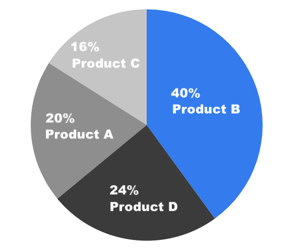
The above is an example using these principles: a “good” pie chart. And it’s still pretty not great, a huge waste of pixels, and easily replaceable by a bar chart.
As an aside, donut charts are just pie charts that are even harder to read. They have less room for proper slice labeling, and now instead of asking a mere human to guestimate the area of a vaguely triangular-shaped thing, you’re asking them to guestimate the area of an arch-shaped thing, and then do that with other arch-shaped things to somehow accurately compare them. Even worse. Just… don’t do this.
When to Use a 3D Donut Chart